This website is best viewed on a desktop.
In order for you to see the best version of my work, including the prototypes, please view my portoflio on a desktop.
In order for you to see the best version of my work, including the prototypes, please view my portoflio on a desktop.
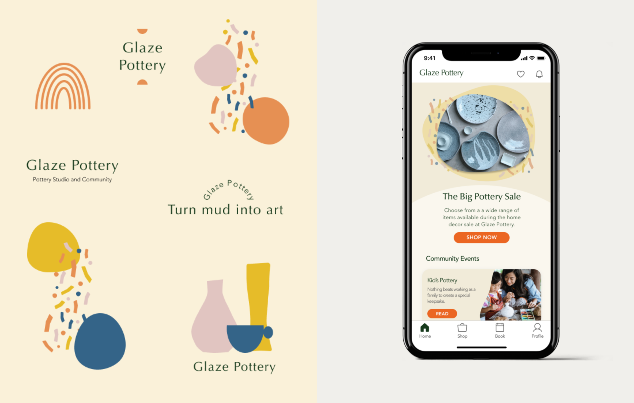
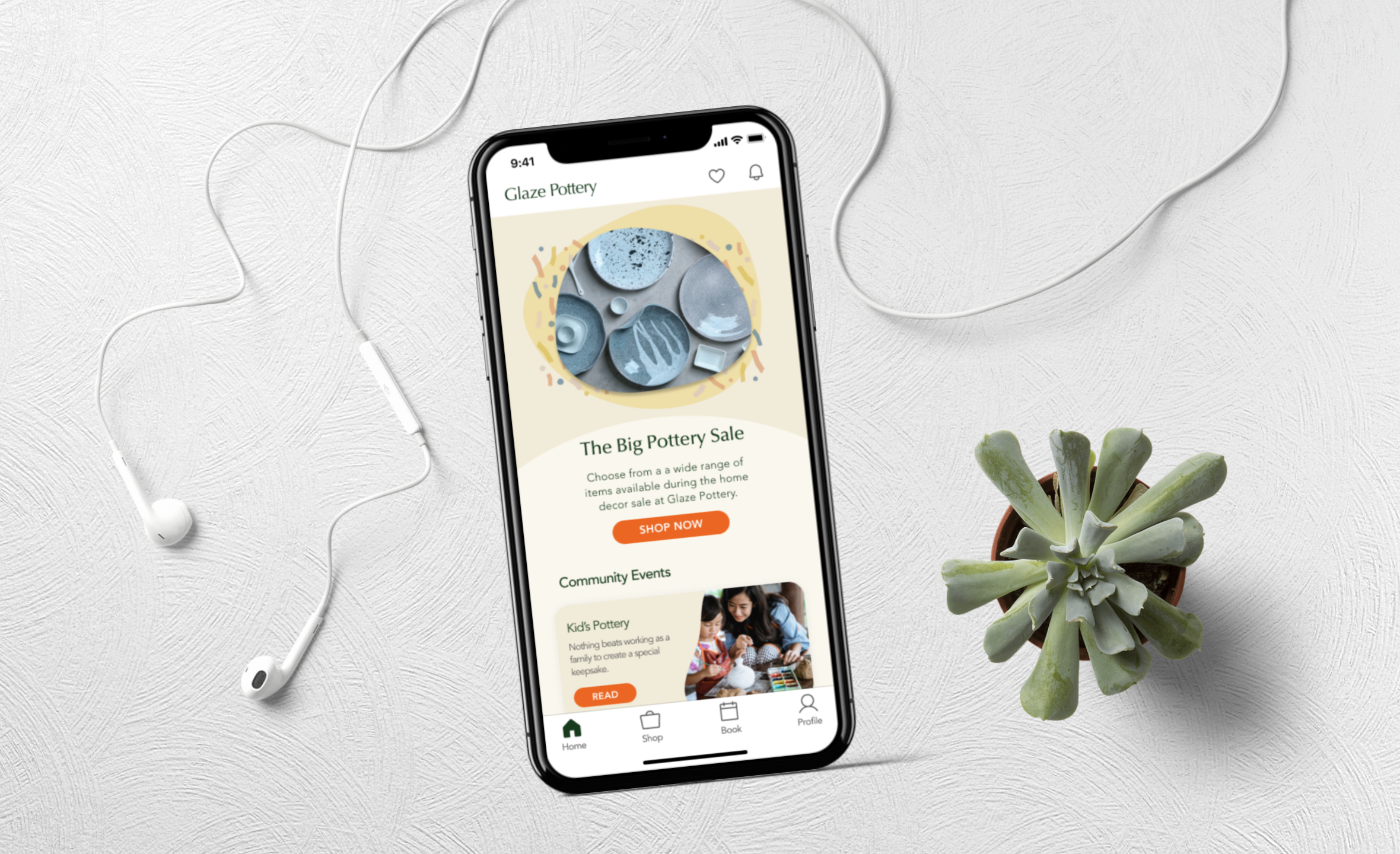
The Glaze Pottery app design is a concept project for an imagined pottery studio and community. Glaze Pottery aims to bring together like-minded people who sees arts and crafts as a form of relaxation, even meditation. Users can see and register for the community events and pottery classes via the app. They can also shop for ceramics and handmade decor.
Product Design, Research, Interaction and Visual Design, Wire-framing and Prototyping.
Figma
It has been over a year since most countries have closed their borders and implemented lockdowns due to the raging pandemic. In light of this, various research have showed that people often reported feeling emotional distress, anxiety and depression with the continued isolation and minimal social connection.
While leisure travel is still not allowed in and out of Singapore, the country has controlled the community cases to a minimum which paved the way to easing the lockdown measures. Now, people are looking for things to do to relax, unwind and gain a sense of some normalcy while being stuck in the small city-state.
Due to COVID-19, there’s been an increased need for features such as online booking and contactless transactions and payments. Most pottery studios in Singapore do not offer these features. For those who do, either the user interface is not friendly (ex. checking the class schedule and dates on a dropdown list) or it’s not easily visible (ex. class schedule is under a ‘Services’ or ‘Shop’ tab).
Create an E-commerce app for a pottery studio which makes class booking and ceramic shopping accessible and easy for users. To further understand the space, I conducted some market research on competitors and understand the current offerings.
There are several pottery studios in Singapore. Most don’t have online booking systems. For those that have this feature, the user journey is not very intuitive. Here’s a closer look at some of the studios that appeared in the top search results.

- Nice looking landing page.
- Offers mindful pottery classes in partnership with a psychologist. It’s a special pottery course dedicated to people who are experiencing stress.
- Does not have an online booking feature.
- Although the schedule of workshops can be seen on the website, the user has to send the studio a message to check on the specific dates.

- The website’s information architecture is simple. The navigation tabs correctly labels the content of each page.
- It shows the price of various classes.
- Does not have an online booking feature.
- Does not have instructions on how to book classes.
- A lot of written content about pottery, different types of classes, what to expect etc.
- It has an online booking feature.
- The landing page looks more like a brochure or newspaper clipping than a website home page.
- The booking feature shows dates via a dropdown list.
Maxine Foo, a junior finance and audit executive in her late 20s, is looking for a new hobby to pick up. She enjoys doing arts and crafts immensenly as it’s the opposite of her everyday work which involves numbers and spreadsheets. She enjoys hanging out with friends, having deep conversations about anything under the sun. She also likes the novelty of meeting new people and trying out different activities.

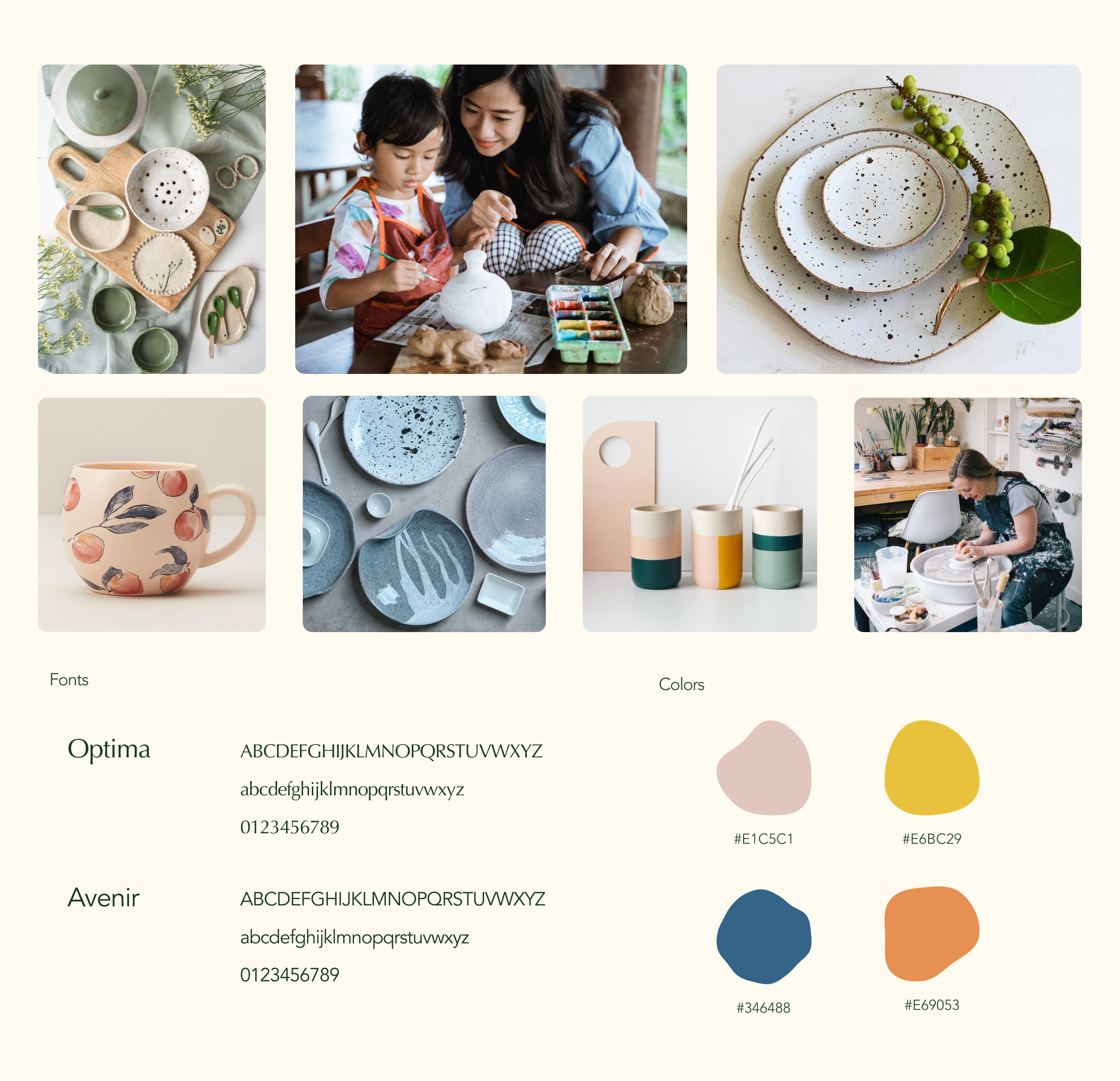
I wanted to mimic the handcrafted feel of ceramic art in the visual design of the app. I experimented with organic shapes and blobs and colored them with earthy yet lively tones.
I experimented with 2 font pairings. I used Optima to give the headlines and title an elegant look. I used Avenir for most of the text and body copy for legibility.
Warm, welcoming and chill.
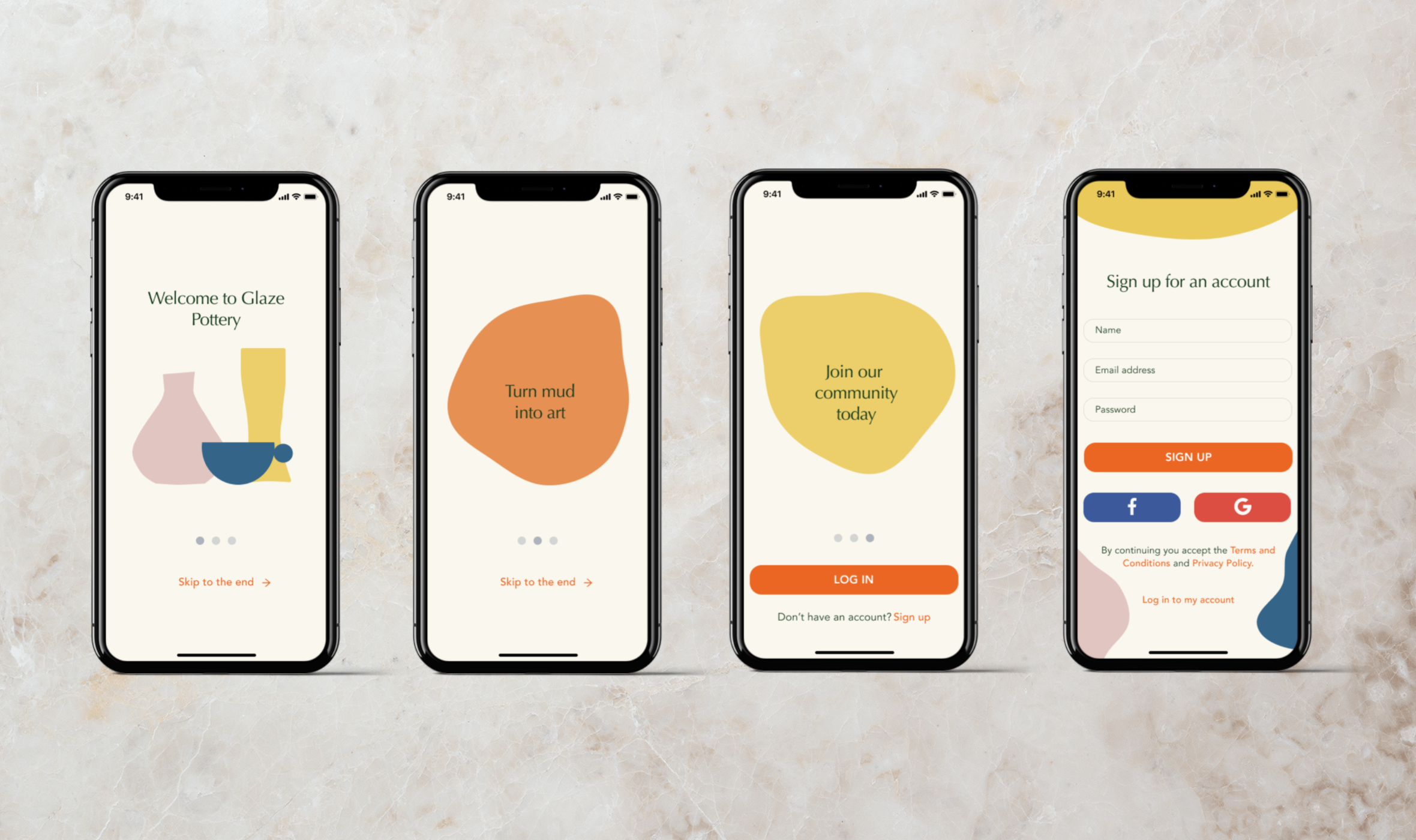
I also conducted a small test on the specific user journey of creating an account and booking a class. The testers noted that the signs to go through these user journeys were clear. There’s a 100% completion of the sign-up without any roadblocks or confusion.
However, some users had missed a feature in the class booking step. Most did not notice that clicking the class card will lead them to giving more information about the type of class they’re booking. They clicked straight away on the ‘Book’ button.
“The design is very appealing. Fonts and color are consistent. I like the orange button also - it’s very easy to spot.”
“I did not know that clicking on the class box will show a pop-up of the details. I think the class info is important for first-timers, so I would expect it to be more visible.”
- Dean, 29 y/o, Senior Cybersecurity Operations Engineer

“It looks nice. The steps are clear. The colors are very pleasing to the eyes.”
“I don’t know where I can see the class details. Is it on the Booking page or Home page?”
- Gloms, 25 y/o, Transport Specialist
Upon conducting the usability test, I’ve identified a gap in understanding on the class booking journey. All of the users mentioned that reading through the details of the different classes are important for them.
With the current design, it was not immediately visible. Therefore, it can be included as a primary change for the next iteration: