This website is best viewed on a desktop.
In order for you to see the best version of my work, including the prototypes, please view my portoflio on a desktop.
In order for you to see the best version of my work, including the prototypes, please view my portoflio on a desktop.
I wanted to deepen my programming skills and learn about new languages, front-end frameworks and libraries available.
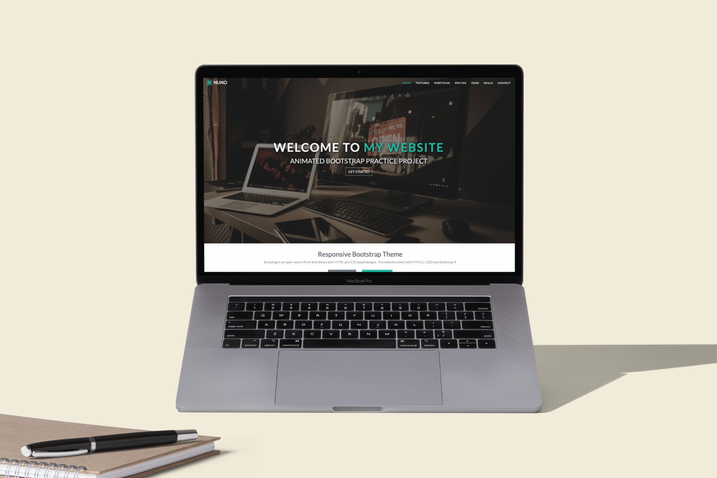
I decided to study Bootstrap - an open source CSS framework, because it’s lightweight and customizable. It also has a responsive structure and style, making mobile-first front-end web development more accessible. It’s also got good documentation and community support.
To put my knowledge to practice, I created this front-end coding project with HTML5, CSS3, Bootstrap and jQuery. It’s a responsive website that scales down to both tablet and mobile screens.
Interface Design, Front-end programming
HTML5, CSS3, Bootstrap 4, Javascript and jQuery
I have coded the website from scratch to explore the various capabilities of Bootstrap 4. Additional resources and libraries were used to complement and achieve some of the micro-interactions. Here are some:
- Responsive grid layout and breakpoints that caters to screens of all sizes, from extra large to small.
- Scrollspy. This automatically updates links in a navigation list based on the current position of the scroll.
- Owl Carousel. A feauture that helps create beautiful responsive carousel sliders.
And many more...
Google Font Library
A catalogue of free, web-safe fonts from Google.
Lightbox Image Gallery
This allows a pop-up, modal, or overlay that shows images or media files on top of the web page.
Animate.css
Enables animations and micro-interactions
Font Awesome
A toolkit of icons based on CSS.
jQuery
A Javascript library that enables easier document object model or DOM manipulation.